Introduction
Starting in 2020, Ecuador experienced a significant increase in the number of violent deaths due to various factors, mainly the deterioration of the economy caused by the fall in oil prices and the COVID-19 pandemic, as well as the defunding of public policy related to social development.
In Ecuador, as in other countries in the region, the availability of data on this topic is scarce or nonexistent. The continuity and consistency of the data vary according to the willingness of the current officials. For example, on the open data portal Datos abiertos , two sets of homicide data can be found for the years 2022 and 2024. However, the fields and details are not consistent.
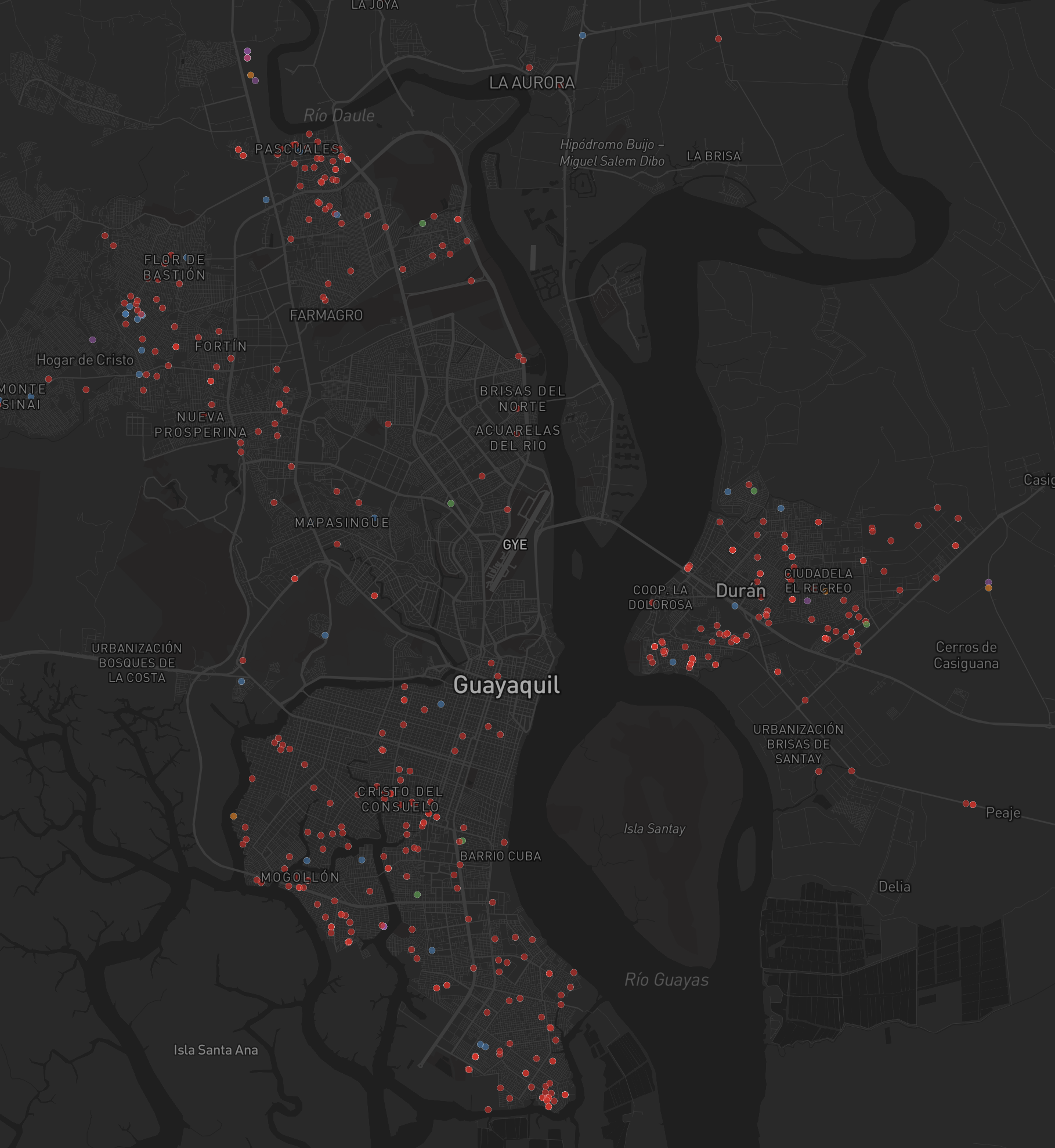
This map uses some of the data available on this platform to show some ways in which these can be visualized and analyzed for decision-making.
The Map
The map was build using Mapbox GL JS libraries and Mapbox Assembly for styling.
The map displays two visualizations of the location of homicide events from January to April 2024. Up to zoom level 9 (provinces), the map shows a heat map that illustrates the density of the events. This allows the user to identify concentration points and zoom in on them. Beyond zoom level 9, the heat map transitions to points of different colors that show the location of each event.


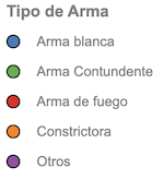
The points are colored based on the type of weapon used. On the left side of the web map, there is a legend that includes a simplified representation of the heat map colors, the colors of the points according to the type of weapon, brief instructions, and the source.

This legend can be collapsed to increase the viewing area, which improves the usability of the map on mobile devices.
Click here to see the map in full screen.